A Deeper Look Into Notebook Color Beef
- David Dar '26

- Feb 28, 2024
- 4 min read
Why and how do we form opinions on this seemingly useless argument?
Subconsciously, colors can affect our thoughts and provoke certain emotions. That ability is often illustrated in marketing and how companies use colors to bring out an intended reaction. Blue is a dependable, soothing color, while red is an energizing color that conveys strong emotions of love or fear. People marketing a product may have to be careful about their color choices for a better effect, but how does the psychology of color affect the colors we choose? And why do the choices we make wind up becoming a choice we defend?
While there are some consistencies in how we view and react to color, our perception of it also isn’t as static as those examples. Notably, our cultures and language affect how we perceive colors. In many languages, there’s no separation between green and blue and they are defined together by one word. A few languages only have words for “dark” and “light” as opposed to defining individual colors, and some may not even have words specifically for color at all.
In the U.S however, there’s a much greater focus on colors and on defining them. That can apply to the color of your house or your car among many other choices. And, every now and then, whether it be among random people online or at school, an argument is started over what colors people choose for their notebooks for each subject. When asking any random person what color an English notebook should be, more often than not, they will have an answer, and often it’s one they feel strongly about. Disagreements over which color applies to which subject often leads to an unwinnable, useless argument. Why does this argument exist? What causes one to strongly believe that math is represented by blue while another thinks a math notebook must always be red?
To delve into the rationale behind notebook color preferences, a survey was conducted among New Roads students, aiming to catalog their choices of notebook colors for different subjects, identifying areas of agreement and disagreement. Data from 40 participants, including insights into their decision-making processes, helped highlight the factors that influence these preferences. These same 40 people selected colors for each subject, with some choosing to elaborate on the decisions they made.
For their Math notebooks, 15.4% of respondents chose black among other colors, but most selected either red (30.8%) or blue (38.5%). “Math is cold and logical,” or more simply “is cool,” explained some of the students who chose blue When it came to the color red, responses ranged from the color giving off more “Pay attention type vibes,” to it more straightforwardly representing…“pain.”

For English notebooks, a 38.6% majority of respondents chose blue, with red trailing at 18.4%, and green garnering 13.2%. “It feels like blue would represent English,” a student explained, with another giving the very “complex” reasoning that “I had an English folder that was green once.” A single outlier choosing orange responded “I personally find English a bit boring, and orange is imo the most boring color.”

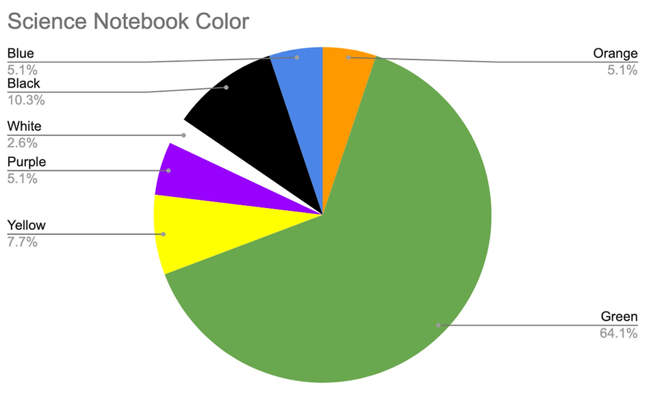
When it came to science notebooks, over 60% of respondents chose green, a much larger majority than any other color choice for any other notebook. “Not sure, this is just the feel it gives me,” shared a respondent who chose green. That same choice was justified in other ways, with one student offering the explanation that green represents “Nature and science in general,” and another respondent with a complete lack of consideration for grammar and sentence structure settling on two words: “because green.”
History notebooks earned the most divided choices, with a nearly even distribution of students choosing blue (15.8%), yellow (18.4%), or purple (21.1%). “History is an important factor leading mankind forward. [History] is light,” and “I like history and yellow is my favorite color,” were the rationales offered by two students.

For language notebooks, responses were similarly divided, the most common choices being red (13.9%), orange (19.4%), and yellow (22.2%). “Some hard rules, so sharper than English, but still similar logic,” and “yellow just feels like lively Spanish,” wrote two students making that color choice. Other people’s choices were inspired by sticking with what worked for them in the past, with one student justifying their choice, by explaining that their language notebook had “always been” red, and another echoing that “In middle school, my language notebook was purple.”

This survey data illustrates where New Roads students agree and disagree on their notebook color choices, but the responses given, although barebones, point out patterns in the reasons why people associate certain colors with certain subjects.
A substantial amount of responses boiled down to “because it is,” being a part of the enigma that is why we make these choices and associations. Many other responses were some form or another of “it has always been,” or “that was my notebook color in elementary school,” demonstrating how our experiences can help form our decisions.
Most interestingly, however, are the responses where people gave reasons as to why a certain color applies to a given subject. Math might be red because the subject and color are “associated with rigor,” or blue because “it’s the most logical.” Observations like these inform on the phenomenon of how color affects us, and also on the thought process behind a decision people talk a lot about.
There’s no clear explanation as to why we make associations with color and why they affect us in the way they do, but when looking at how they can be used in marketing or for our school subjects, patterns begin to appear about how we feel about, and how we use color.
Regardless of whether English or Math is red to you, the conclusions we draw and the colors we choose are all a matter of perspective, formed by an array of personal – and often rather questionable – factors.


Comments